Are you a blogger that wants to make sure that you get the site traffic you need to maintain a steady income? Do you want to be the best in your niche? Do you want to build a solid website? Well, collecting information about website builders by visiting resources like Website Advisor and deciding on a color scheme is important, but you also want to focus on your user experience when designing your website and blog. You want to ensure that your visitors can easily navigate the site and can find what they’re looking for.

You don’t want your site visitors to spend more time looking for your contact information that they end up leaving, so thinking about basic UX design principles is a great way to keep your target audience in mind. So, how do you make your UX good for your audience?
Contents
Focus on Meeting User’s Needs
Designing a blog to your specifications can be exciting and you may have a lot of ideas about how you want your website to look. However, what may seem like a great design to you may not be the best for your users. So, what is user experience design? It is essentially making sure that your site is easy to use from a visitor’s standpoint.
Having a tricky design that makes it difficult to tell where to go to find your about me section, or your contact info will turn users off, even if the site looks gorgeous. So, you need to design your blog with your users in mind. Make sure that your information and site navigation is simple, and ensure that users can find what they need to know easily.
You can choose to do user testing of your site to find out what is good or bad about your design from the users themselves, or you can keep things simple and focus on your good and services so that you know your visitors can find what they need with just the click of a mouse.
Hierarchy
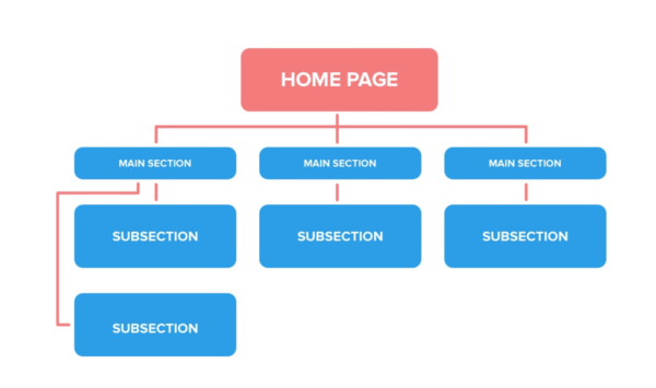
This term is something that goes unnoticed in most sites when you are a user, however, it is one of the most important UX design aspects that your blog needs. A hierarchy basically determines what the main part of your site is, and how users can navigate to get to other webpages within your site.

The top-level of the hierarchy has the main sections of the website that users will see first. This is the home page, which includes the main parts of the site that people will likely go to first. This typically includes the about me section and the contact page. As a blogger, one of those sections should be the main blog page.
After users click on the blog section, it takes them to the second level of the hierarchy. This level contains the blogs themselves, which can be split up into different categories that make it easy for users to find a specific topic. The more specific the topics get, the lower on the hierarchy it is.
This structure is often not on the user’s radar, but if it’s not incorporated, they will likely notice a difference between sites that use this principle in their design and those that don’t. This is a clear design principle that is needed for good user experience but is not always the first thing that’s thought of when designing a blog.
So, keep this hierarchy in mind when creating your blog and website so that your users are able to easily navigate the site and find what they need so they keep coming back.
Stick to a Simple Design
Although it can be tempting to use many visual design ideas to add some extra flair to your blog, this is actually a bad idea.
Research shows that a whopping 94% of website visitors will make a first impression about the company based purely on the website design. So sticking with some basic designs and blog templates may be a good way to go.

Users don’t want to have to work too hard to get to the information they need, and although your site may be fresh and different if they have to look too hard to find what they need they will leave the site.
Don’t get carried away with all the designs that you can change and add to, and stick to the basics. A clean, smoothly-ran site will get you a lot farther than you think.
Ask for Confirmation
When on your site, users may end up doing something that wasn’t intended. This could be accidentally putting in the wrong email or clicking a payment button for a product that they don’t want to purchase.
Some sites will make it easy for users to fall into this trap and complete an action that they did not mean to take, so asking for confirmation on irreversible or permanent actions can enhance their experience.
Imagine trying to buy a product on someone’s site and a pop-up on the screen offers a limited chance to get another product for a lower price. This pop-up may be quick, which makes it easy for a user to accidentally click on it.
This could add the product into their cart and, if there is no confirmation, they could end up paying for it if their payment information was already entered.
This could ruin a user’s experience because they have to call and fix the issue, which is something that no blogger wants to happen. So, an easy way to avoid this issue is to add confirmations to each irreversible action. That way, if a user clicks on something they didn’t mean to, they can just cancel the action before it goes through.
More User Control
User experience is focused on how the visitor of your site can navigate, and this is much easier when you give them the ability to have more control over where they go. If you have a large number of blogs, then you want the user to be able to click through many options and easily go back to one they want without having to look through all the items before it.
Some UX design examples of this design principle are users being able to go back to the previous screen with a back button or being able to have a drop-down menu that allows them to choose the exact page that they want to go back to. This allows users to have control of where they want to go within the site and gives them the power to do so easily.
Users want to have control over their actions, and they may feel frustrated if a site doesn’t allow them that freedom. So, keep your users in mind when creating your site and allow them to go back to previous pages or search for a specific destination within the site so that they feel in control of their actions and decision while checking out your blog.
Great UX Is Crucial for Any Type of Website
When it comes to the design of your blog, there are a few things that you may not think of that actually make or break the user’s experience. Keeping in mind the user’s needs, hierarchy, consistency, confirmations, and user control you will be able to make a site that users love. So, stick to these basic design principles, and you will have repeat users that keep coming back to view your content.


